Pokemon designs that were ruined by 3D models

Bibarel has art, sprites, PC icons, you name it, as this sort of pose which makes you expect it's a biped.


And while I do know this Pokemon can and does go on its fours (the anime, HeartGold/SoulSilver following sprite, and Pokemon Mystery Dungeon), I always found that pose awkward and probably need to be redesigned, or at least have some artwork or it on its fours so the first time seeing that 3D model won't be so strange.


Another thing I don't like about this pose and angling is that if you're using it, you get a .... nice?... view behind it. You just can't help it.

It's paws are obviously designed to be bipedal too (the front limbs are stubbier and the paws look more like hands), which makes it weird. Same oddity as with Purrloin being originally designed as a quadruped and then transitioned into a biped, but retaining certain characteristics which make it look awkward.
 

Codraroll

Cod Mod
is a Forum Moderatoris a Community Contributoris a Top Smogon Media Contributor
Moderator
Also, that cantilevered tail...

Aren't beaver tails a little more saggy than that? Is it meant to be a balloon? Why is gravity not affecting it at all?
 
Is no one going to talk about the injustice about our lord and savior Gyarados?


Look at this beast back in Red


HG/SS was pretty good too, its the reason why I kept Red Gyarados


Current Gen.....it looks off..maybe the mouth being slightly too narrow?

Lets not even talk about Mega Gyarados....

If you look at the full idle animation, Gyarados opens and "closes" (it's still open) its mouth periodically, as if breathing. Its mouth is just as agape as usual in the high pose. Also, Gyarados did the same thing (albeit to a lesser extent) in Black and White.
 

Pikachu315111

Ranting & Raving!
is a Community Contributoris a Top Smogon Media Contributor


HG/SS was pretty good too, its the reason why I kept Red Gyarados


Current Gen.....it looks off..maybe the mouth being slightly too narrow?
To me Gyarados looks scrunched up, like the head-to-tail length of HGSS Gyarados is 20 feet but the h-t-t length for 3D model Gyarados is around 15.
 

bdt2002

Pokémon Ranger: Guardian Signs superfan
is a Pre-Contributor
(STILL no mention of Gen 3 Feraligatr's back sprite lol)

Sadly I am unable to post pictures like you guys but I still wanna list off some of my favorites, or in this case, least faves.

1. Mienshao from Gen 5 has to be one of the least talked about yet worst examples of the sprite transition in all of Pokémon. I don't know how else to put it. Luckily its pre evolution Minefoo isn't nearly as bad here. Just look at them side by side. Just look!

2. Crobat in Gen 4, specifically the Platinum sprite was always one of my personal favorites. From there it got less and less intimidating until Gen 6 where it literally looks like purple plastic with wings.

3. One word. One Pokémon. VILEPLUME.


Feraligatr is PHAT. AND TEAL!


Pretty sure it's unflattering angles, though, but yeah....

it still beats out


Honestly, what's the deal with those back bumps besides being the butt of jokes?

Mienshao doesn't seem too bad to me?


The sprite looks worse when it's animated. What is it doing!? Knitting invisible socks?


I also don't think Crobat was ever meant to be all intimidating... But yeah, its Platinum sprite is pretty cool looking.


I say it's better than the pathetic flapping blob that is the Black White one. Holy hell that doesn't look like a Pokemon who's supposed to have a blistering 130 speed.


And the 3D model's animation, I think, looks really cool. I like how the back wings upstroke is same pace as the big wings, but downstroke is at a slower pace. It alternates the flapping pattern making it interesting to look at. Crobat isn't ruined, IMO, the Black White one is much worse.


-----


I don't see what's wrong with Vileplume either


Yeah, you don't get to see its head, but you're not always seeing it at this angle. The camera's constantly moving and such. Vileplume's older sprites always seem to tilt its head toward you so you can see its petals better, but this comes at the expense of the sprite proportions sometimes, IMO.


This is the Gen III Ruby Sapphire sprite and yeah, that hat doesn't seem to be connected to the head at all.
 

bdt2002

Pokémon Ranger: Guardian Signs superfan
is a Pre-Contributor
I don't see what's wrong with Vileplume either


Yeah, you don't get to see its head, but you're not always seeing it at this angle. The camera's constantly moving and such. Vileplume's older sprites always seem to tilt its head toward you so you can see its petals better, but this comes at the expense of the sprite proportions sometimes, IMO.


This is the Gen III Ruby Sapphire sprite and yeah, that hat doesn't seem to be connected to the head at all.
[/QUOTE]
I only think Vile plume is bad up close lo'
 

Codraroll

Cod Mod
is a Forum Moderatoris a Community Contributoris a Top Smogon Media Contributor
Moderator
Vileplume's design is a little flawed in general, I think. Like Golem, it took advantage of a static 2D perspective, so it could be drawn showing its face and its petals at the same time, regardless of the angle. But that's a geometric impossibility in 3D, unless there was a large and unflattering stalk underneath the flower (and 2D drawings from that perspective showed this not to be the case). So just as Golem has awkwardly placed limbs now, Vileplume can no longer show both its flower and its face at the same time.
 
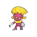
Shiny Weavile. In gen 5 both Weavile and Sneasel had pretty cool shinys.

And then gen 6 came along.

They changed shiny Weavile's colors to an ugly shade of hot pinkish-purple. Shiny Sneasel and Weavile had similar looking color schemes in gen 5, and for some reason they only changed Weavile's colors in gen 6.
 
I'm really puzzled by that change. It's a shame, because it's a really nice shade of pink. You can't even say it's the saturation of the textures this time, they actually increased the saturation this time. I also think the yellow looks worse too. This looks like it was made by someone who can't discern color all that well.
 

Users Who Are Viewing This Thread (Users: 1, Guests: 1)

Top