A ReCAP: Artistic Designs that Almost Made It
| « Previous Article | Home | Next Article » |
Introduction
Artwork is an important part of any Pokémon design, arguably more so than the movepool and base stat spread. The art is what defines a Pokémon as 'cute' (think Clefairy), 'badass' (think Rayquaza), or simply weird (think Wobbuffet!) Due to this, in the Create-A-Pokémon section of Smogon, the art submissions and subsequent polls can get very heated with opinion and support for the various designs. Every winning design is breathtaking in both execution and concept, though there are some gems that didn't win hidden in the CAP archives. This article will aim to highlight only a few of the vast array of fantastic submissions from CAP regulars and one-hit-wonders alike, and hopefully inspire you, the reader, to delve into the art submissions yourselves!
CAP #1 – Syclant
As Smogon's first ever homebrew Pokémon, Syclant underwent a process with more than its fair share of bumps. Unlike later CAPs, typing was determined before a concept for what purpose exactly this Pokémon should serve. What the community decided on was a fast and powerful Ice/Bug mixed sweeper; CyzirVisheen's design, chosen by CAP voters, perfectly reflects this. As to be expected, however, Smogon's many artists were quick to seize the opportunity to design Smogon's first CAP.

DougJustDoug actually ended up submitting two designs to the final poll, but "skibug", as he dubbed it back then, was the most popular of these, drawing from the praying mantis and from Flygon in particular. The long, sleek design emphasizes the Pokémon's Speed, and skis connote the Ice-type strongly. In the end skibug was passed over, perhaps for the slightly awkward-looking skis, and also for its similarities—though intentional—to Flygon.
KoA chose to not restrict his source material to one existing bug, but instead to draw inspiration from several existing bugs. The design resembles wasps and dragonflies in particular. This Pokémon is again long and thing to emphasis its Speed, but also possess wings, suggesting a third "hidden" type: Flying. The icy coating on the claws and wings suggest the ability to damage both physically and specially. Perhaps the design would have fared better had it been treated to a lick of paint!

JustSomeChick may well be just some chick—posting this singular CAP design and then seemingly vanishing into thin air—but her scarfed bug won the hearts of voters in the initial art design polls, placing second only to the Syclant we recognize today. The stylized head and eyes gives this Pokémon a unique and appealing aesthetic, and the snowflake-tipped wings are a clever touch to keep it from looking too much like a bug and nothing more. The wings also run into the scarf that reminds us that this Pokémon has to deal with some chilly temperatures! Unfortunately, this submission may have suffered in light of DougJustDoug's slightly similar one, but also does not particularly look like a potent sweeper, either special or physical.
CAP #2 – Revenankh
Still in the early stages of the CAP project, the community decided to create a bulky yet powerful Ghost / Fighting Pokémon. Revenankh is now one of the best special walls of the CAP metagame, also snatching away the title of best spinblocker from Rotom-A. Using its unresisted STAB moves, Revenankh can become a potent offensive threat with Bulk Up. It was important that the design reflected Revenankh's balanced talents, and KoA took a clear win with the muscular mummy we know today.
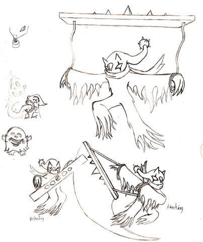
However, in the early days of CAP, participants could submit more than one entry! With this Banette evolution, KoA gained second place too, and for good reason. Though the CAP submissions of today would be significantly more polished than this in terms of aesthetics, KoA's concept is brilliant. It is difficult for Pokémon to pull off weapons well, so when a weapon is incorporated seamlessly into a design it deserves applause (don't forget to clap for Farfetch'd too!)
CAP #3 – Pyroak
Pyroak was originally created with SubBeeding in mind, with great defenses, but with a decent Attack score and powerful moves such as Flare Blitz and Wood Hammer, Pyroak can be quite the threat to unprepared teams. In the end, Elagune's wood-clad lizard was chosen as the final design, but every submission excelled despite the difficult Grass/Fire typing.
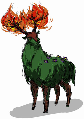
Cartoons!, now a regular contributor to CAP, burst onto the scene with what I consider to be one of his best designs, second only to the ambidextrous Fidgit. The sketchy brush-strokes show the coarse texture perfectly, and the fire is expertly distributed —one can imagine this deer ramming into something with those antlers! The expression is aptly defined—not intimidating, but certainly willing to be so if angered. Small touches such as the flowers finish this masterpiece, a piece of art that was only the beginning of Cartoons!'s CAP career.

If KoA's previous designs weren't already badass enough, then this fire-breathing cockatrice takes the cake. Though it unfortunately wasn't treated to any color, the line art is crisp and clear, and it is detailed, yet not overly so. As with Cartoons!'s design, it contains a good balance of both the Grass- and Fire-type. In fact, I'd go so far as to say that this could have won, if only it had been colored!
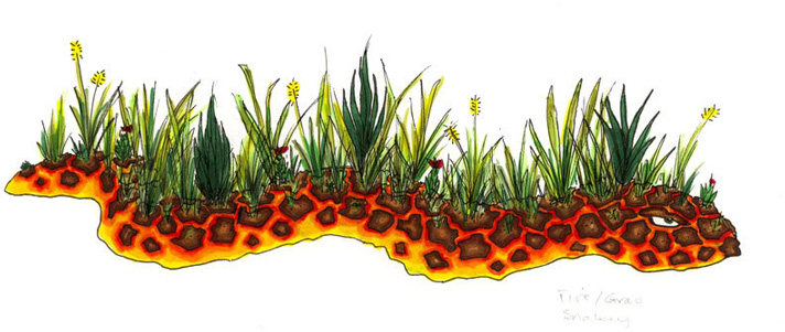
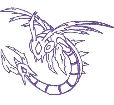
Pyrrhocorax, with a name reminiscent of that of CAP #3, successfully strayed from the norm with this lava snake. Magma is a difficult texture to achieve, but Pyrrhocorax has managed with roughly concentric shading around the "stones" in the lava that resemble snakeskin. Unfortunately, however, it seems that the reeds on its back were an afterthought.
CAP #4 – Fidgit
Though we have all come to know and love Cartoons!'s many-limbed, smiley design, its Poison/Ground typing led to a large diversity in submissions—the next two are completely different!
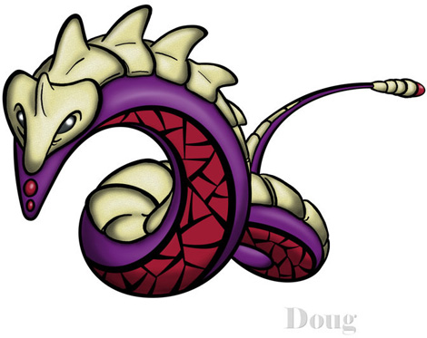
DougJustDoug once again throws his hat into the ring with this armored serpent. While the design in itself may not be as extravagant as some others in CAP history, the main selling points of this piece are the expert texture and Doug's trademark smooth lines. While the flesh of this purple rattlesnake is softly rendered, the "armor" is speckled. This adds a sense of roughness without making it look cracked or overly rough.
I said that the two designs were completely different, but did you expect Elagune's design to be this different? Instead of opting for a snake of some kind, Elagune has instead created a genie-like colossus for his/her design. While it may not seem Poison-typed in its features, this is offset by the purple color scheme, contrasted nicely with the beige smoke. Small details such as the shoulder being reminiscent of a PokéBall complete the submission.
CAP #5 – Stratagem
Stratagem was a Pokémon designed to break the mold, and it succeeded on all accounts—it is now a feared, Rock-type special sweeper in the CAP metagame; it has top-notch Special Attack combined with blistering Speed and a good movepool. Being purely Rock-typed left the theme for designs completely open, and completely open was what the competition entailed.
Caladbolg teamed up with Skyshroud to create this Easter Island-themed design. The Rock typing is obviously conveyed, with glowing gemstones and inscriptions on the body to add to the mystical nature of the concept. It is unfortunate that some aspects of the piece seem rushed, though this is eclipsed by the innovative design.
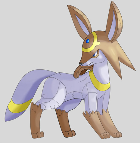
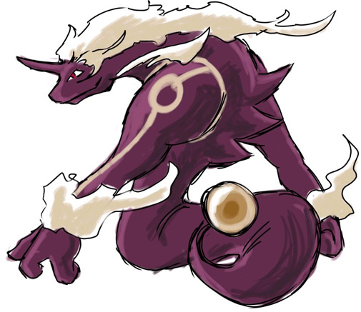
Yes, even with the dawn of the fifth generation, we are still waiting for a Rock-type Eeveelution; however, RegiDS attempted to compensate for this by making a CAP art submission of it—rather successfully too! The edges of the rock are expertly placed to reflect the muscles of the dog, with bands of yellow adding much-needed contrast in color to the piece.

There has never been, and will most likely never be, an art submission from the brilliant DougJustDoug that will disappoint the viewer. Once again cool is balanced against cute with this Saturn-themed design. The shades top it all off for me. It rocks!
CAP #6 – Arghonaut
CAP #6, later known as (you guessed it) Arghonaut, was designed with the concept of "Decentralizer". This meant that Arghonaut would be designed to take on at least two of the top 10 most used Pokémon. With a brilliant ability in Unaware and being defensive, while not being feeble offensively, make Arghonaut a good choice on many teams. With a Water/Fighting typing, the art side of things was very open ended, as the following designs will prove.

CyzirVisheen impressed with this bright anemone warrior. While the design may not be the most complex, its abundant color and quirky features are brilliant. Artistically, in true CyzirVisheen style, it is superb. However, maybe it could have been slightly neater around the edges.
Later dubbed as "Vitalimar" in Cartoons!'s 2D fighter, known as "Battle CAPacity", this design netted him 3rd place in the art polls. With this design, Cartoons! has successfully combined a dynamic pose with being "badass", and somehow made it lovable too.
Just like Doug, keen ornithologist Wyverii never fails to impress, though in a completely different style. Her command over pixel art is simply breathtaking—the shading is perfect, the anatomy is perfect, everything is perfect. This design could have easily won, yet was relegated to fourth place, showing just how tough these art polls are!
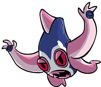
CAP #7 – Kitsunoh
CAP #7's concept was that of the 'Ultimate Scout', a Pokémon designed to be speedy, with a good (but precise) movepool, including moves such as U-turn to reveal as much of the opponent's team as possible. With a Ghost/Steel typing CAP #7 had a variety of different art concepts. However, the feline fiend we now know as Kitsunoh came out on top. As usual, however, there were some very interesting concepts submitted.
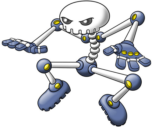
DougJustDoug's "Skulloton" is a brilliantly innovative design, and Doug's obligatory submission to the art section of CAP. With this design, the relative simplicity is key, as a scout is a relatively simple role—switch in, use U-turn. However, small details such as the yellow screws add a healthy dose of color to the design, and the slightly abnormal shape of the skull add to the robotic, man-made feel. Artistically, it is executed well. The shading is smooth, and the outline is perfect. However, extra use of highlights might be better—it is metal, after all.

Wyverii's jack-in-the-box ghoul is great not only because of its devilishly delightful design but because of the story with which it was presented. Wyverii's shading and outlining is second to none, recognizing both the texture and contours of the design.
CAP #8 – Cyclohm
The concept of CAP #8, later known as Cyclohm, was that of "under-appreciated ability". Utilizing Shield Dust or Static, Cyclohm is a mean physical tank with an above average Special Attack stat—hitting all the harder from two fantastic STABs in Electric and Dragon. While one might think that "Dragon" can only mean a flying lizard that breathes fire, in the art submissions for CAP #8 the concept of "Dragon" was stretched to its limits to find some very unorthodox but brilliant concepts.


At 'Dragon', most think of winged, fire-breathing beasts. However, Ixfalia was inspired by the Japanese god of lightning. With a primarily black color scheme, Ixfalia's snake is certainly bad ass, and even more so with the ring around its head!
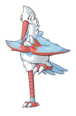
CAP #9 – Colossoil
CAP #9, later known as Colossoil, has become a dominant force in the CAP metagame. With mean attack, above average bulk, and decent Speed, its Dark / Ground typing puts the icing on the drill of CyzirVisheen's design—a moling whale. However, this was one of the most hotly contested polls to date, with many fantastic entries that varied widely in design.
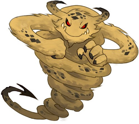
aragornbird gained a lot of early popularity with this design—after all, what's not to love about an evil, Taz the Tasmanian devil-esque demon? The design gets straight to the point with fangs, claws and even demonic red eyes, while keeping the Ground-typing obvious with the color scheme. The shading is particularly interesting, making the design look rough.
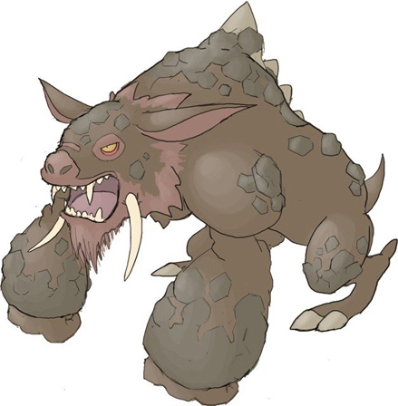
Buffalo_Wings has designs that always contain a large element of "badassery" in them, and his entry for CAP 9 was no exception. The powerful arms and legs indicate the Pokémon is brutally powerful and capable of great speeds for its size. The craggy features that adorn its body represent the Ground typing very well, and while the design uses darker tones it doesn't take the easy road with excessive black.

Caladbolg~ had a submission that provided an excellent balance of toughness with some elegance and even some charm. As a whole the design feels very coordinated and complete, with no excessive frills or gimmicks. Some of his earlier work in progress variants possessed more spikes than the final submission, but they were left out for the final submission. On balance this made the submission better because too many people take Dark typing and try to make everything look more evil or vicious than they should.

Scicky drew on the thorny devil for his inspiration, and it worked wonderfully for the concept. Low to the ground, ferocious, spiny, and with enough sleekness to look speedy as well. It married the type perfectly and even though the base animal could easily be more embellished, the design is actually reserved, adding to its overall plausibility.
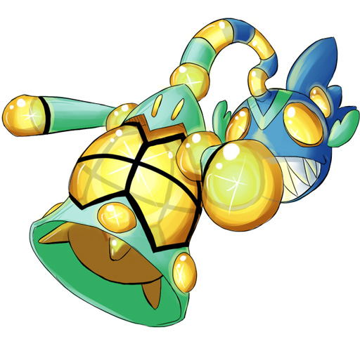
CAP #10 – Krilowatt
Krilowatt was designed to be a utility counter. Its purpose was to be able to counter any given Pokémon with one of its sets, but not so threatening that it countered everything at once.

Cartoons!'s submission scored high marks on its cuteness and flexibility. A hallmark of Cartoons!'s submissions are his supporting artwork, and he usually makes a little animated .gif of the new Pokémon. Although it was cute it was also flexible and versatile, and all the better for paying homage to Pokémon's cuter critters.

DougJustDoug offered us a bite of woodland goodness with his beaver-inspired design. Its tail contains hotspots much like a power grid and by its design template we're to assume it builds hydroelectric dams. The design perfectly encapsulates both Water and Electric elements in a very organic package.

Keishinkae came up with a jarring, jagged design that perfectly illustrated the Electric type. Its alternating blue color scheme contributes to its Water-type features, and it's based largely on the plesiosaur, a creature Lapras also shares a base with. The striking features are what set it most apart from other CAP designs, as usually smooth angles and lines dominate the field. What's not to like about that face?

Rocket Grunt fished up a bulb-ous piranha for his design. It combines common elements of a fishing lure with the tapered rear fins and inlaid gemworks along its lower body. The most enjoyable element of this design in contrast to DougJustDoug's is just how inorganically the final product is rendered, but not in a way to detract from its plausibility. Excellent execution, though it was unfortunately too small to be accepted into submissions.
CAP #11 – Voodoom
Voodoom's purpose was to create an offensive core with a pre-existing partner, in this case Togekiss.

Wyverii presented a cunning design based on the wily raccoon. It uses the standard black and gray coon colors but also adds a vibrant blue into the mix. The gem in the chest helps to convey Volt Absorb, as all of CAP 11's artists were crunched creating something that fit Fighting/Dark with Volt Absorb in terms of flavor.

Kukem had a design that was extremely popular all the way up to the final poll. The design is based on a small mammal known as the loris. Kukem's design definitely "took a level in badass" over the other designs, with its sleek, almost metallic appearance. It definitely delivered a lot of punch, and the sash tied around its waist is to indicate its Fighting-type.
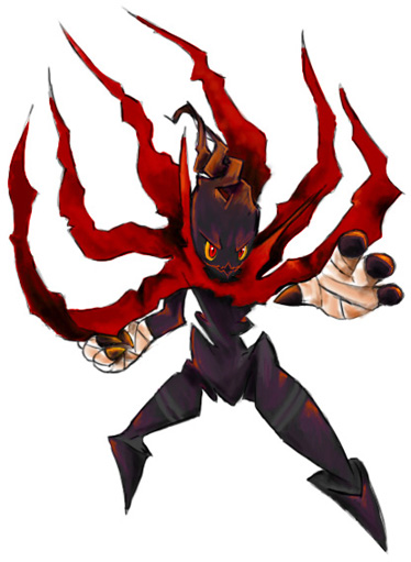
darkmattr brought a devilish-looking character with a crimson cape that could act as a lightning rod if needed. The jagged lines and menacing aura gave the design a very dark feeling, and the hand bandages tied in the fighting element.

Yilx took a classic "femme fatale" approach to his design, even going so far as to include catlike "ears" shaped into horns and tapering ponytails. Its demonic elements are very well-executed and believable, and the proportions are perfectly in line with Pokémon's slight exaggerations on the extremities.
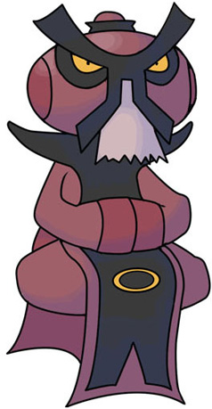
Buffalo_Wings contributed a dark zen master design, meshing the elements of a martial arts master with the dull tones and sinister appearance of a masked warrior. It too perfectly mimics many of the humanoid characteristics of Pokémon in the Humanshape group without losing that exaggerated flair that sets them apart.
Final Thoughts
There may be some who never even look at the CAP forum, let alone take part in it, and only see the final product posted on the main page. There are so many brilliant aspects of the CAP project, not only the art segment, that have many brilliant ideas that fall at the final hurdle. These artists have all done fantastic designs, and should be applauded for their efforts.
| « Previous Article | Home | Next Article » |