


It seems they are not playable, I've added them there just in case, but at the moment will not include them in the project.Layell are you still looking to have the Ultra Beasts sprited? i don't think we can play them in S/M but i noticed you put them on the list
in case you are, i wanna call dibs on Absorption :P

-
Welcome to Smeargle's Studio! Please be sure to review the studio rules. Feel also free to check out our hub to learn more about this place!Welcome to Smogon! Take a moment to read the Introduction to Smogon for a run-down on everything Smogon, and make sure you take some time to read the global rules.Congrats to the winners of the 2023 Smog Awards!
Sticky Sun/Moon Sprite Project
- Thread starter Layell
- Start date


Still far from perfect, but better than my last version I think. Main changes are to the mane, but other areas got pixel pushed too. I also kinda just want to say that lep's version has an incorrect head shape, as Mudsdale has a rounded "Roman" nose/snout, whereas lep gave it a very defined dip that just doesn't exist.
 Last edited:My version of Jangmo-o :>


I know the vid you're talking about! Ugh, should've bookmarked that or something...I can't seem to find it now @_@ Can you link the video please?also Wobblebuns since there's a new trailer with the back view of Solgaleo in full range of motion, I think it'd be great if you used that as reference if you plan on tweaking your backsprite :D
EDIT: I would also like to reserve Grubbin, heheh.
EDIT 2: Nvm leparagon, I found it!
Last edited:
We'll be going with this version of the dinosaur, I consulted my top-secret expert on cuteness.My version of Jangmo-o :>
Fixed hindlegs (I hope, lol), added muscle definition and tweaked the mustache.
OldNew

- - -
Also, adorable, candy corn grub!


(I like how its color scheme is similar with Solgaleo, heheh) Sunfished size is better now! :D but i think the curve of the bottom part could be smoother. also same for the top part of its fin (there are two diagonal single pixels, where it should have been one single pixel followed above it by two horizontal pixels)
Wobblebuns i love the Grubbin sprites! :D but the Solgaleo backsprites, i still have some qualms with the leg markings xD mind if i take a shot at QCing those parts some time? ideally this coming weekend since i have exams for now xD
Yes please, the back sprite is driving me mad. @_@"Sunfished size is better now! :D but i think the curve of the bottom part could be smoother. also same for the top part of its fin (there are two diagonal single pixels, where it should have been one single pixel followed above it by two horizontal pixels)
Wobblebuns i love the Grubbin sprites! :D but the Solgaleo backsprites, i still have some qualms with the leg markings xD mind if i take a shot at QCing those parts some time? ideally this coming weekend since i have exams for now xD
Some very minor QC on Grubbin so that the back sprite's external outline isn't completely black.
aXl My only nitpick about Sandslash is that its eyes seem like they're bulging out on both the front and back sprites. Otherwise, the sprites look great, especially the ice and shading.
Sunfished About the new Bruxish, the distance from the lips to the eyes seems rather long. One thing you could do to check the proportions is to reduce the Sugimori art to the size of the sprite and place them side by side for comparison.
I also wanted to mention to HeaLnDeaL and any other newcomers that, for the purposes of this sprite project and the previous one, doing pixel-overs is perfectly acceptable. Ideally, they shouldn't be the only tool in one's arsenal, and some base images are less well-suited to be traced over than others based on factors such as angle and pose. Combining tracing and scratch spriting in addition to making good use of references can make it easier to get the proportions right.
And a small announcement... I've re-published release v1.1 of the XY Sprite Project after discovering that shiny Clauncher had the wrong palette in my rush to wrap things up and made some final changes in the process. If you suspect that you don't have the right version, I'd recommend downloading the archive again (the latest version will say "September 20, 2016" in the readme). Sorry for the inconvenience! Posting here instead of in the old thread because I want to let the old thread rest in peace, and this thread's view count is rising like bread in the oven, so I'm assuming that the message will get across.Last edited:
calling dibs on Passimianinterested in Oranguru if i finish before someone else calls dibs
qc on Comfey (sorry, only got to working on it now)decided that making it a wee bit bigger would help the details (if i didn't make it bigger, everything would be too scrunched up). had to sacrifice some colors by homogenizing red and pink flowers into an off-red. did the same thing for the tufts beside its face, the face itself, and the yellow flowers. backsprite to follow
fixed the tail on 100 Zygarde backsprite that Regime pointed out to me on my profile page. tagged Layell in that old post to notify him of the change
update: done with Passimian backsprite. i already made an Oranguru for DA last night, so i just touched it up a bit . backsprite coming soon
also, i saw the Mimikyu sprite, and idk with Layell but i kinda wanna change it xD i already had this Mimikyu sprited a long time ago:leaving it here in case it can be usedLast edited:jams
Probably some stuff I could fix with this but figured I'd post it now since don't know when I'll have time to continue updating it and figured I could fish for suggestions in the mean time. Also, pom, got it, I'll see what I can do.
leparagon, very quick nitpick but I'd either lower passimian's face or raise its right arm as currently its muzzle is going straight into the gray of the arm making where it ends and the arm begins muddied and hard to read. also can't help but feel that Oranguru might be a tad small but I haven't checked sizes so maybe that's the right size idk.Last edited:
all right, gonna fix Passimian when i get home xD and i checked the sizes before, and Oranguru is like 4'something and Passimian is like 6'07 when standing upjams
View attachment 70165
Probably some stuff I could fix with this but figured I'd post it now since don't know when I'll have time to continue updating it and figured I could fish for suggestions in the mean time. Also, pom, got it, I'll see what I can do.
leparagon, very quick nitpick but I'd either lower passimian's face or raise its right arm as currently its muzzle is going straight into the gray of the arm making where it ends and the arm begins muddied and hard to read. also can't help but feel that Oranguru might be a tad small but I haven't checked sizes so maybe that's the right size idk.
beware of bears!!
View attachment 70358
I moved around the legs and mouth on Stufful as suggested by Wobble and settled on Bewear's size by comparing it with other mons within the same height group (this edit is one pixel taller than Snorlax). The back sprite will take more time, as I realized that leparagon never made a matching back for the larger front, so I'll leave this here for now and return to it another day. Further suggestions for improvement are welcome.
aXl Glad to see Midnight Lycanroc in full colour. I still can't help but feel that the emo hair is distracting as a result of the angle, though. Maybe move its right foot (our left) a bit closer to the center so that its stance looks more firm?
leparagon Comfey looks great (it's like the Klefki of Gen VII... tiny Fairy carrying giant objects that's obnoxious to sprite), and I'd agree that the size increase was justified. The apes are mostly good, although the top curve of Passimian's tail (both front and back) could be smoother, and Oranguru's fan seems rough.Last edited:
princessofmusic will make a backsprite for it soon xD also the sprites look great! i like the shade you used for Stufful's arms better. for Bewear, i understand why you made the line on the arms that way, but building on yours, i think the arms could look like this:i usually do that type of AA with arms that have difficult curves/lines
aXl and pom, thanks for the critique, will fix them soon. btw axl, you tagged the wrong pom in your last message lol. also I just noticed this, but I think your midnight Lycanroc could use a more vibrant shade of red. it has a bit too much of a pink hue
still gonna work on the other stuff i have to do
also i wasn't able to post this earlier cuz i had to go out, but here's day form:i actually made the front for both forms like a week or two ago but i only made the backsprite today hahaLast edited:
Jangmo-o QC
OLD
NEW
Credit goes to Wobble for the wonderful original set. At first, I set out just to make the body less vertically squished and edit the legs but ended up also fine-tuning the scales and a few other details. I'm actually particularly proud of how this QC turned out ;__;
Also made some further edits to Stufful and Bewear with a variation on leparagon's changes.
I totally forgot to respond to this earlier, but for future reference, the forum software doesn't recognize tags that are edited into an existing post. Better to notify the person in a new post or leave a VM depending on the urgency of the message.tagged Layell in that old post to notify him of the change
I like Midday Lycanroc's back sprite, but on the front sprite, the top line of the snout and the ears seem slightly misaligned, and the way that the front legs attach to the body is also strange.Last edited:Attempt at a QC for Rockruff. Rounded the face more and edited other details (eyes, ears). Fur collar was made to be cleaner and look more accurate(?) given how the head is positioned. The stance looks a bit too "stiff" so I made some adjustments with the legs. Also, now that a Rockruff back has surfaced for a long while now (before princess-phoenix got a hold of it), appropriate edits were done.
Old
New

 sorry took so long, just got to work on Oranguru backsprite now. fixed a couple things axl and pom mentioned and a few other things i noticed. Oranguru fan and backsprite based on game footage instead this time. Passimian's tail still seems slightly off to me, but i'm not sure. will work it out this weekend prolly. if it turns out to be okay, then we good fam
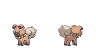
also i updated Alolan Rattata:
LONG POST AHEAD:
also princessofmusic i noticed you AA'd the arms, but in a different position. it looks better than the original, but it still gives off the impression that the sprite's arm isn't as smooth a curve as it should be:
(left to right: original, yours, mine) the reason i put the antialiasing between the outline and the base color was for it to act as an intermediate, so it smooths the curve in better. it's okay to break the outline for sprites. Gamefreak didn't really use this technique, but they really should have. they do some other tricks with their sprites. sometimes it works, but other times it doesn't:notice Natu's head feather (looks broken), Ursaring's right shoulder (broke the line but it works), Gabite 's right head-torpedo (dark outline with one pixel changed to a light color too abruptly), Pupitar's topmost horn (doesn't look as smooth), Lampent's hat/cover/lid on either side (not as smooth as they should be).
in cases like Ursaring, it looks just fine, but it was unnecessary to remove that one pixel to break the outline. for Natu, it could have been smoothed out by either fixing the position of pixels in the outline or just using AA differently. for Gabite, from afar it looks fine, but a careful eye would notice that abrupt break in the outline. Pupitar is a prime example of where they could have utilized the type of AA i was trynna show with Bewear. Lampent, it seems instead of AA, Gamefreak just overlapped one black pixel on top of the regular outline, when they could have just either AA'd it or just moved the outline.
that was a post for anyone reading it so that it could maybe help them. used official sprites as examples to show that we don't always have to follow Gamefreak's spriting "rules". MAIN POINT IS (sorry took so long :P) for sudden changes in outlines, the AA i showed can actually be kinda helpfulLast edited:
I brushed up my old Zygarde Core aka Squishy sprite from the previous project circa late 2015.
As Showdown won't be needing BW-style Zygarde Core sprites, these are targeted more to fan game makers and anyone else watching this thread.
leparagon Many of aXl's sprite drafts from the early stages of the XY Sprite Project used the technique you describe above, and Layell and I generally removed it in QC. While I can't speak for Layell's reasons for doing so, for me, it was because this style of anti-aliasing tends to show up poorly on dark backgrounds. This is relevant because many of Showdown's battle backgrounds are medium rather than pale in brightness, so for this project, it's important to keep in mind how each sprite will look on non-white backgrounds. I myself am guilty of always spriting on pure white canvases, which is why I like to test what I have against random backdrops (something like this). Smogon's current forum layout having an off-white background doesn't exactly help matters.
Also, correct me if I just missed it, but I noticed that most of the sprites you linked don't use the exact technique you're discussing. An example of a BW sprite that makes extensive use of it is Tropius:

My stance is this kind of "zigzag" anti-aliasing is best when used sparingly and for the internal details of a sprite (such as Zygarde Core's eye above) rather than along the external outline. It's still early in the project to hone in on minor details, and we can always shelve Bewear's front sprite for now and return to it when we have a better idea of what the rest of the new designs will look like for the sake of stylistic consistency.
While we're on the topic of outlines, I'd like to highlight some less optimal ways of colouring outlines and alternatives to them:
Above is the same curve coloured in two different ways. The example on the left is fine (outer black, inner colour), but in the right-hand example (outer colour, inner black), the inside colours and coloured outlines form a "corner" rather than a smooth curve when shown on a darker background.
These are two different approaches to anti-aliasing on outlines. The external anti-aliasing on the left is present on some past gen official sprites and blends in well on light-coloured backdrops but stands out on dark-coloured ones. The internal anti-aliasing on the right is safer on all backgrounds.
Those are just a few spriting-related pet peeves, and hopefully, my MS Paint diagrams aren't too terrible to comprehend. Thankfully, outlines are generally pretty easy to fix via some redrawing and recolouring.
thanks to pom for the tips. i don't go on Showdown too much so i didn't realize how many dark backgrounds they had xD i work on white backgrounds too but it wasn't really a problem for me before cuz most backgrounds people used with stuff i sprited for them were fairly light. but i know better now :D also btw i was already aware of the last antialiasing tip you mentioned, but the first one with the outlining thing is something new to me so i'm gonna apply that from now on xD
also the evolutions were recently revealed. i wanna call dibs on Dartrix :DTorracat looks terrifyingly generic.
Reserving Brionne!Pop star Pokemon is cute. ;3;


looks awesome, Wobble! although i think you used black lines on some parts that don't need it ^^"Pop star Pokemon is cute. ;3;
Users Who Are Viewing This Thread (Users: 1, Guests: 2)
- ... and 1 more.


