CAP 5 CAP 5 - Sprite Submissions

Status
Not open for further replies.
Your sprite has 17 colours, that's one too many, also, I can't really picture it... in shoddy battle :S

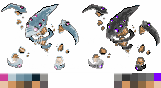
I'd like people to keep in mind that this thing is going for 90 HP, so the sprite should look considerably bulky (AKA. My current one :3)


I can't see atryoki's sprite.
Could someone upload it to photobucket so i can see it?

Also, i couldn't help but to come back and edit my sprite some.
Fixed some details. checked color scheme to make sure i had less than 16 (i had some unused color blocks).
Tell me what you think, peple.
 
I can't see atryoki's sprite.
Could someone upload it to photobucket so i can see it?

Also, i couldn't help but to come back and edit my sprite some.
Fixed some details. checked color scheme to make sure i had less than 16 (i had some unused color blocks).
Tell me what you think, peple.
I don't like the purple eyes on the shiny, can't really see them. Hmm, possibly a bit more definition with the black lines and more black than dark gray for the shiny, with maybe a gleam to it... just some spontaneous thoughts, anyone else have comments?
 
SO MANY GOOD SPRITES

Seriously spriters, pat yourselves on the back. Do it.

Atyr - is that your final, final sprite? I really don't like seeing the thread flooded with color-related resposes until you get your stuff finalized. Just saying bro.
 
I don't like it either man, but I want to find a shiny that people will find
appealing ._.

Those are probably my final colours though... at least I hope...

and if not, I'll just end up linking to them instead of showing them in the thread
 
Atyroki, excellent work on the sprites so far! The others are looking good as well! This sprites for this CAP are turning out really well.
 

DougJustDoug

Knows the great enthusiasms
is a Site Content Manageris a Top Artistis a Programmeris a Forum Moderatoris a Top CAP Contributoris a Battle Simulator Admin Alumnusis a Smogon Discord Contributor Alumnusis a Top Tiering Contributor Alumnusis an Administrator Alumnus
Moderator


I've got a lotta tweaking to do.

I disliked the limbs so I redid them completely. I loathe using grey/greyish colour schemes and i'm very unhappy with it so far so i'll be messing with it further.
I liked your first one better, Wyverri.

I agree the limbs were a tad awkward, but not by much. I don't think they required a total rework. The new limbs don't look like the "claws" from YDG's design. I think your new interpretation is still within the bounds of "artistic license", but I don't think they improve the sprite. I do like the improved symmetry of the claws in your second sprite. But, I think by slightly changing the position of your first claws, you could achieve the same effect.

I also liked the first head. It's sleeker and faster-looking.
 

I think I have to do some tweaking to it.
This is incredible. (Actually, so are the others, I think the overall sprite quality will be comparable to that of the concept art submissions.)

The placement of the arms, the overall balance... very nice. I think you've also done the best job in terms of color and shading -- the colors are solid and smooth in all the right places, just like a real DP sprite. It would not look out of place whatsoever in the actual game, and I'm surprised you haven't attracted as much attention as you should have.

I know you said you need to tweak it, but I can't see where. An artist knows his work best, though, and I can't wait to see your improvements in areas I probably wasn't even perceptive enough to see could be improved.

Also, Wyverii's sprite is very close in quality in my opinion. His and DarthVader317's have my full support at the moment, and I hope they go far.
 

X-Act

np: Biffy Clyro - Shock Shock
is a Site Content Manager Alumnusis a Programmer Alumnusis a Smogon Discord Contributor Alumnusis a Top Researcher Alumnusis a Top CAP Contributor Alumnusis a Top Tiering Contributor Alumnusis a Top Contributor Alumnusis a Smogon Media Contributor Alumnusis an Administrator Alumnus
Sprites that point the wrong way are NOT wrong, people.

For example, look at the sprite for Skuntank in DP and in Pt:

http://www.serebii.net/pokedex-dp/435.shtml

The Platinum sprite is certainly pointing the 'wrong' way.

(Although it might be facing that way to, you know, shoot us a nasty gas!)

DP's Mismagius' sprite also points the 'wrong' way.


Urf, pick your favourite design. It seems some people like more bulkiness while others prefer super sleek.
I prefer the third design. I just think the claws look better and the whole thing looks more streamlined, I guess. In fact, looking at these sprites, I'm starting to grow a lot more fond of YDG's design.
 
To be honest, this guy looks like a rock psychic...
Wyverii- Your spriting style is really good, but the cartoonish look just doesn't fit this guy. try making him look a little bit more bold.
By the way, the original artist had a bluish aura around all of his floating rocks.
EDIT: Completely removed the gray outlines and replaced them with black and dark blue-green the color of our guy).

New shiny color. im considering doing multiple shiny's and having you guys telling me which one to use.
 
Sprites that point the wrong way are NOT wrong, people.

For example, look at the sprite for Skuntank in DP and in Pt:

http://www.serebii.net/pokedex-dp/435.shtml

The Platinum sprite is certainly pointing the 'wrong' way.

(Although it might be facing that way to, you know, shoot us a nasty gas!)

DP's Mismagius' sprite also points the 'wrong' way.
yeah, but generally, even if the body is facing the "wrong" way, the head is still turning towards the left.


Urf, pick your favourite design. It seems some people like more bulkiness while others prefer super sleek.
Leaning between the first and third, I would really like to see of this guy as if he were moving, and that first sprite is already pretty close to something that would be moving, just reposition his claws maybe...
 
Sprites that point the wrong way are NOT wrong, people.

For example, look at the sprite for Skuntank in DP and in Pt:

http://www.serebii.net/pokedex-dp/435.shtml

The Platinum sprite is certainly pointing the 'wrong' way.

(Although it might be facing that way to, you know, shoot us a nasty gas!)

DP's Mismagius' sprite also points the 'wrong' way.
Most sprites face left. You're right that not all the D/P sprites do, such as:


They've either got a head pointed at you or they're looking to the left. I think the reason most people decided going to the right with this guy is the 'wrong way', is because you can't really point the eyes to the left without moving the head (which moves the sprite to the left) because it has no pupils.
 

DougJustDoug

Knows the great enthusiasms
is a Site Content Manageris a Top Artistis a Programmeris a Forum Moderatoris a Top CAP Contributoris a Battle Simulator Admin Alumnusis a Smogon Discord Contributor Alumnusis a Top Tiering Contributor Alumnusis an Administrator Alumnus
Moderator
This is the very first part of the OP:

People should only post here if they are submitting something or are critiquing something, be it positive or negative. This is so the thread doesn't become clogged with "zomg niec art!"
Please adhere to this rule.
 
--->
--->

old ------------- edit1 ----------- edit2
I REALLY like this one, and considering the level of the submissions so far, that's a lot. As Doug said, the fact that it is small IS a very strong point of this one. It's supposed to be frail and fast, after all.

Regarding the shiny sprite, maybe green for the eye gems could be better than yellow? It's not as bright, so the white on the reflections could be seen better.

Also, Maybe I'd like the head a tiny bit bigger. I say maybe because I'm not sure it would be an improvement, but if you are willing to experiment, that's a direction I'd follow.
 
Here is my sprite on shoddy.
any suggestions for the shiny color? I'm going to take any suggestions and use them, then you guys can decide which one you like the most.
 
Status
Not open for further replies.

Users Who Are Viewing This Thread (Users: 1, Guests: 0)

Top